ggplot2 /2022-06-15
ggplot设计理念
ggplot: gramer of graphics
ggplot的设计理念是从数据(data)到几何图形(geom_)属性的映射(mapping),当我们绘图时我们所需要考虑的仅仅是哪些数据能够决定最终的图形,例如当绘制箱型图时,我们需要的一个向量的几个分位数便能够决定最终的图形,而定义这种从数据到图形属性的映射则是由标度(scale)决定的,图例就是这一标度的体现;而从一个向量到最终绘图所需要的统计量则是由统计变化(stat_)决定的,当向量没有进行统计变化时,我们称之为等值变化。以上四个部分:数据,统计变化,映射,几何图形,最后加上位置(position)则构成了一个图层(layer)。
统计变化:
几何图形:按功能进行划分:表现数量,表现分布,比较,拟合曲(待续)
图形属性:位置(x,y轴), shape size, color fill, line width line type, alpah group.
除了上面所提到的5个部分,ggplot还有四个部件用于修饰图形:
- coord
- facet
- theme
- output
写在ggplot里面,全局映射,写在几何形状里面,比如说geom_point则为局部映射。
图片保存:ggsave.
图层的三种实现方式
图形语法——geom_
- Plot, the device containing your data:
ggplot(data = mydata) - Specify the type of your graph and the variables to use:
+geom_point(ase(x = body weight, y = wingspan)) - Add labels and titles:
+ labs(x = "body weight(g)", y = "wingspan", title = "heavy birds have long wings") - Customize the look of your plot with themes
+theme_bw()
统计变化语法——stat_
尽管我们在谈论
geom_*()的局限性,从而衬托出stat_*()的强大,但并不意味了后者可以取代前者,因为这不是一个非此即彼的问题,事实上,他们彼此依赖——我们看到stat_summary()有 geom 参数,geom_*()也有 stat 参数。 在更高的层级上讲,stat_*()和geom_*()都只是ggplot里构建图层的layer()函数的一个便利的方法,用曹植的《七步诗》来说, 本是同根生,相煎何太急。
将
layer()分成stat_*()和geom_*()两块,或许是一个失误,最后我们用Hadley的原话来结束本章内容。
Unfortunately, due to an early design mistake I called these either stat_() or geom_(). A better decision would have been to call them layer_() functions: that’s a more accurate description because every layer involves a stat and a geom
图层语法——layer
我们在绘制几何图形时,几何图形所需要的数据映射可能不是原始数据,而是原始数据的统计量,在我们考虑用geom_*时,该函数自动计算了我们需要的统计值,而当我们考虑使用stat_时,我们指定了需要计算的值,而后在stat_*函数中指定这些统计值映射到哪个几何图形。两者本是一体,当我们从layer的角度考虑是,我们的重点是了解我们所需要的geom,其所需要的映射值需要从原始数据中经过什么stat生成。
金玉其外——如何美化图形
当我们考虑美化或者修改图形的的时候我们在考虑什么?借用逻辑哲学论的一句话,一个物的属性是无穷的,在这里我们想要修改图形,重要的是一个图形由哪些元素(element)构成,每一个元素有什么属性(attributs)可以修改。
由内而外——定义从数据到图形属性的映射,从而改变配色与图例
标度:标度定义了数据空间的某个区域(标度的定义域)到图形属性空间的某个区域(标度的值域)的一个函数,标度用于调整数据映射的图形属性。标度有三个属性可以修改break,label,name,与坐标轴,图例一致。
注意到,标度函数是由“-”分割的三个部分构成的 - scale - 视觉属性名 (e.g., colour, shape or x) - 标度名 (e.g., continuous, discrete, brewer).(图,待粘贴)
配色
颜色的3个属性:色相,色度,明亮度(hue-chroma-luminance)
以colorspace包为例:
3种类型的模板:qualitative, sequential, divergng.
查看模板:hcl_plattes
获取模板下颜色的值: colorspace::sequential_hcl(n = 7, palette = "Peach")
查看模板的颜色:colorspace::sequential_hcl(n = 7, palette = "Peach") %>% colorspace::swatchplot()
在ggplot2中可以免去手工操作,而直接使用。事实上, colorspace 模板使用起来很方便,有统一格式scale_<aesthetic>_<datatype>_<colorscale>().
这里 <aesthetic> 是指定映射 (fill, color, colour).
这里 <datatype> 是表明数据变量的类型 (discrete, continuous, binned).
这里 color scale 是声明颜色标度类型 (qualitative, sequential, diverging, divergingx).
Scale function Aesthetic Data type Palette type
- scale_color_discrete_qualitative() color discrete qualitative
- scale_fill_continuous_sequential() fill continuous sequential
- scale_colour_continous_divergingx() colour continuous diverging
定制颜色:
scale_fill_manual()
scale_color_manual( values = c("#195744", "#008148", "#C6C013", "#EF8A17", "#EF2917") )
图例
待编辑
由外而内——PS大法
主题设置
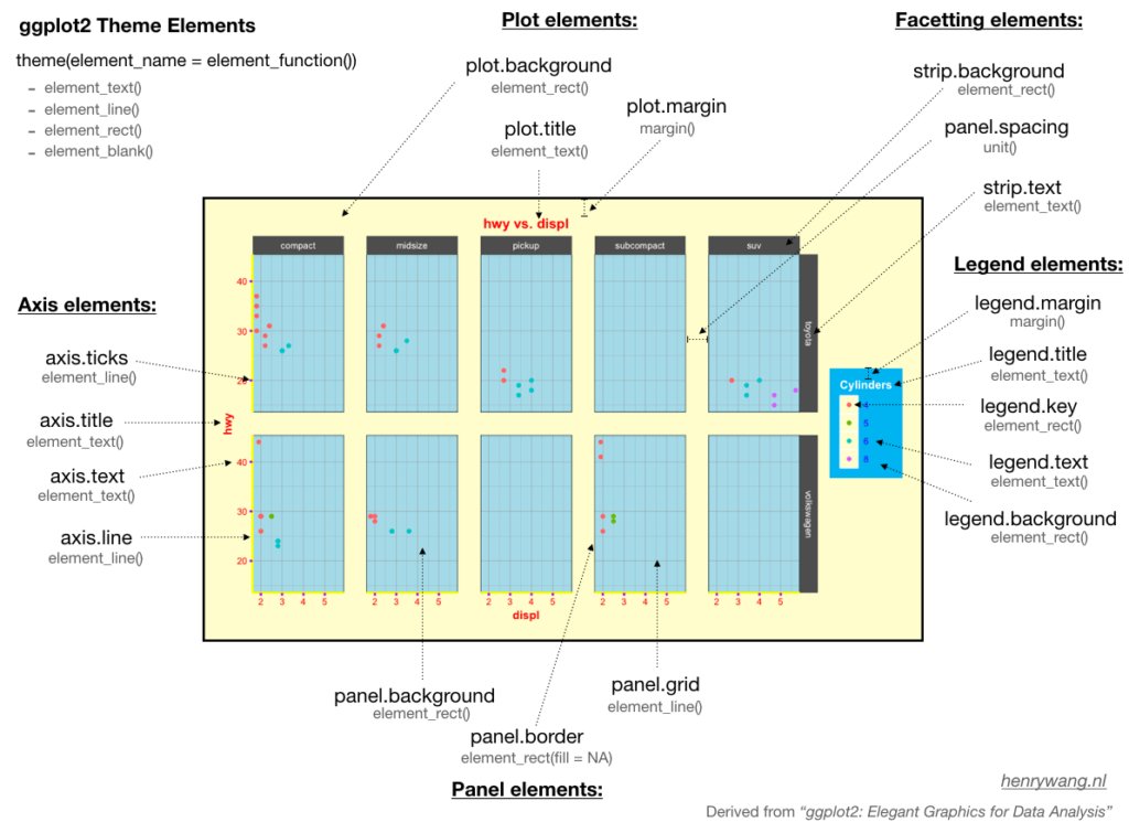
四个函数:element_text,element_line,element_rect, element_balnk
function:
element_text(), 文本,一般用于控制标签和标题的字体风格element_line(), 线条,一般用于控制线条或线段的颜色或线条类型element_rect(), 矩形区域,一般用于控制背景矩形的颜色或者边界线条类型element_blank(), 空白,就是不分配相应的绘图空间,即删去这个地方的绘图元素。margin(),position()(top bottom left right)
element.attributes:
- plot.background plot.title plot.margin
- panel.background panel.grid panel.border
- axis.ticks axis.title axis.text axis.line
- legend.background .key .text .title . margin .position
- strip.background .text panel.spacing
More:
- ggthemes包提供了许多主题。
- plot和panel的区别?
panel是数据的映射,直观体现为x、y平面的内容,而plot还包括了除此以外的各种注释信息。
仅改变图例外观
前面ggplot2章节,我们知道美学映射和相应的标度函数可以同时调整图形的效果和图例的外观。但有时候,我们只想改变图例的外形,并不想影响图形的效果。我们可以把图例独立出来作为一个图调整其美学参数进行修改。
- 调整美学参数
guides(color = guide_legend(override.aes = list(size = 3) ) ). - 压缩图例中一部分美学映射
guides(color = guide_legend(override.aes = list(linetype = c(1, 0, 0)))). - 组合两个图层的图例。
具体思路,是把一个都没用的美学属性映射成常数,这样会形成一个新的图例,然后再修改这个图例,把图例中的符号弄成想要的。
scale_alpha_manual(
    name = NULL,
    values = c(1, 1),
    breaks = c("Observed", "Fitted")
  ) +
  guides(alpha = guide_legend(override.aes = list(
    linetype = c(0, 1),  # 0无线条; 1有线条
    shape = c(16, NA),   # 16点的形状; NA没有点
    color = "black"
  )))
scale_alpha_manual(
  name = NULL,
  values = c(1, 1),
  breaks = c("Observed", "Fitted"),
  guide = guide_legend(override.aes = list(linetype = c(0, 1),
                                           shape = c(16, NA),
                                           color = "black"))
)
- 控制多个图例的外观 默认的点的形状是不可填充颜色的,图例默认的形状也是不可填充颜色的形状。
dat %>%
  ggplot(aes(x = x, y = y, fill = g1, shape = g2) ) +
  geom_point(size = 5) +
  scale_shape_manual(values = c(21, 24) ) +
  guides(fill = guide_legend(override.aes = list(shape = 21) ),
         shape = guide_legend(override.aes = list(fill = "black") ) )
扩展
字体
- Family: font family
- Face: bold italic, plain
- Color: Size angle, etc 其中,family =字体名,可以用 extrafont 导入C:\Windows\Fonts\的字体,然后选取
中文字体:
有时我们需要保存图片,图片有中文字符,就需要加载library(showtext)宏包。
图片标题使用了中文字体,但中文字体无法显示。解决方案是R code chunks加上fig.showtext=TRUE
```{r, fig.showtext=TRUE}
Latex 公式
library(ggplot2)
library(latex2exp)

ggplot(mpg, aes(x = displ, y = hwy)) +
  geom_point() +
  annotate("text",
    x = 4, y = 40,
    label = TeX("$\\alpha^2 + \\theta^2 = \\omega^2 $"),
    size = 9
  ) +
  labs(
    title = TeX("The ratio of 1 and 2 is $\\,\\, \\frac{1}{2}$"),
    x = TeX("$\\alpha$"),
    y = TeX("$\\alpha^2$")
  )
文本标注
ggforces::geom_mark_ellipse(aes(
    filter = gdp > 7000,
    label = "rich country"
    description = "what country are they?"
))
文本弯曲
geom_text_repel(
    aes(label = label),
    size = 4.5,
    point.padding = .2,
    box.padding = .3,
    force = 1,
    min.segment.length = 0
  )
定制标签
labs( title = "My Plot Title", subtitle = "My Plot subtitle", x = "The X Variable", y = "The Y Variable" )
图片组合
cowplot::plot_grid( p1, p2, labels = c("A", "B") )
library(patchwork) p1 + p2 p1 / p2
p1 + p2 + plot_annotation( tag_levels = "A", title = "The surprising truth about mtcars", subtitle = "These 3 plots will reveal yet-untold secrets about our beloved data-set", caption = "Disclaimer: None of these plots are insightful" )
g1 + g2 + patchwork::plot_layout(guides = "collect")
Patchwork图(待粘贴)
高亮某一组
- ggplot2
- gghighlight
本质就是一个dpLyr::filter()
gghighlight( country == "China", # which is passed to dplyr::filter(). label_key = country )
3D
library(ggfx)
# https://github.com/thomasp85/ggfx

mtcars %>%
 ggplot(aes(mpg, disp)) +
 with_shadow(
   geom_smooth(alpha = 1), sigma = 4
 ) +
 with_shadow(
   geom_point(), sigma = 4
 )
函数图
d <- tibble(x = rnorm(2000, mean = 2, sd = 4))

ggplot(data = d, aes(x = x)) +
  geom_histogram(aes(y = after_stat(density))) +
  geom_density() +
  stat_function(fun = dnorm, args = list(mean = 2, sd = 4), colour = "red")`
coord_cartesian() 与 scale_x_continuous()
scale_x_continuous(limits = c(325,500)) 的骚操作,会把limits指定范围之外的点全部弄成NA, 也就说改变了原始数据,那么 geom_smooth() 会基于调整之后的数据做平滑曲线。
coord_cartesian(xlim = c(325,500)) 操作,不会改变数据,只是拿了一个放大镜,重点显示xlim = c(325, 500)这个范围。
延迟映射
绝大部分时候,数据框的变量直接映射到图形元素,然后生成图片。但也有一些时候,变量需要先做统计变换,然后再映射给图形元素,这个过程称之为延迟映射。
ggplot2 把进行数据映射分成了三个阶段。
- 第一个阶段,拿到数据之后。最初阶段,拿到用户提供的数据,映射给图形元素。
- 第二个阶段,统计变换之后。数据完成转化或者统计计算之后,再映射给图形元素。
- 第三个阶段,图形标度之后。数据完成标度配置之后,映射给图形元素,在最后渲染出图之前。
如果不是直接使用原始数据,而是用统计变换后的数据来映射,就需要使用after_stat()函数告诉ggplot2 等到统计变换完成后再做美学映射。类似地,如果想在完成标度配置之后,再映射给图形元素,就需要使用after_scale()函数。如果多次映射图形元素,比如变量 x 先传递给统计函数,然后把统计结果映射给图形元素,就需要使用 stage(start = NULL, after_stat = NULL, after_scale = NULL) 控制每一个过程。
拿到数据之后:
penguins %>%
  ggplot(aes(x = bill_length_mm)) +
  geom_histogram(aes(y = after_stat(count)))
统计变换之后:
penguins %>%
  ggplot(aes(x = bill_length_mm)) +
  geom_histogram(aes(y = after_stat(count)))
延迟到图形标度以后:
penguins %>%
  ggplot(aes(x = species, color = species)) +
  geom_bar(
    aes(fill = after_scale(alpha(color, 0.6)))
  )
多次映射:
penguins %>%
  ggplot(aes(x = species)) +
  geom_bar(
    aes(fill = stage(start = species, after_scale = alpha(fill, 0.4)))
  )